I am a person who takes others at face value. I don’t immediately classify someone as pretty or ugly, gay or straight, progressive or conservative (unless, either way, they are hateful or prejudiced – then the deal is off) , black or white or some other colour, blonde or brunette, or anything else. I don’t care if they’re plain or fancy, nor do I care if they’re pretty or not. I try to take each person as they are and let their integrity speak louder than their features. I like to get to know them before I make any decisions about them.
When it comes to fonts, however, i am nowhere near as open-minded. Don’t get me wrong – there are plenty of fonts I like, and many others that I will view with an open mind depending on context and purpose.
But there ARE two or three fonts I really hate. I refuse to use them. I have handed back an assignment or two, asking for it to be reprinted in a more acceptable typeface. It’s true: I am Fontist.
I wasn’t raised that way. We didn’t really need to think about fonts back then. When I was growing up, it seemed as thought books were printed in two, maybe three different standard fonts. From memory, there was something like Times New Roman, a basic Sans Serif, and possibly another standard typewriter-style serif font. There was never a question of what typeface to submit our work in, because computers weren’t a thing and our school work was all handwritten. When I started university, assignments and essays had to be typed and double-spaced, so I used my parents’ typewriter. Of course, it only got to the typing stage when one or two hand-written drafts had been painstakingly written, proofread, edited, and revised.
Don’t get me wrong: I’m glad those days are over. I appreciate the ease of writing using my laptop as much as anyone else, and I’m happy for my students to do some – but not all – of their work on their devices.
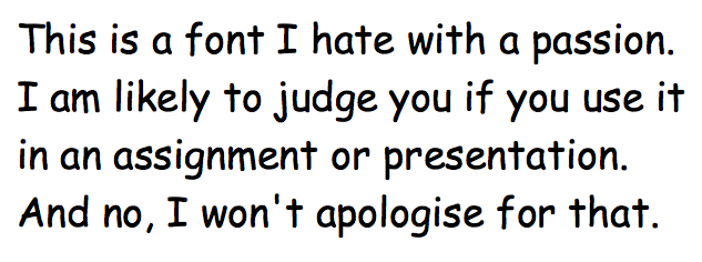
My underlying Fontism rears its ugly head, though, when someone hands in an assignment or broadcasts a presentation on the screen that screams “ridiculous font” louder than anything the student is trying to communicate. The same thing happens in meetings and seminars where the important information is obscured by the poor choice of font on the screen or handout.
You might think I’m overreacting. But consider this: I might read fifty student assignments in less than a week, or sit through twenty five student presentations in two or three days. When their font suggests I shouldn’t be taking their work seriously, that’s a complication neither they nor I need.
Right at the top of my hate list is Comic Sans. It looks childish, and gets increasingly ridiculous as the size increases, to the point where it is almost impossible for me to take anything printed in that font seriously. It is a font that should never be used for school work of any description by anyone older than six, nor should it be used for slide shows and presentations. Yes, it is “nice and clear for people to read”, but so are about 3000 other fonts one could choose. If your audience is not entirely in the First Grade, choose something else.
Another font I hate is Arial. Yes, it is also nice and clear for people to read. It is also entirely bland and unimaginative. Arial is the font equivalent of still having that original iPhone Marimba ring tone from 2008 on your new iPhoneX when you have 2500 different songs on your playlists. It is the font for lazy people who don’t care how their work looks. It doesn’t take much effort to switch so something equally clear but which looks a lot more polished and professional. In a word: boring.
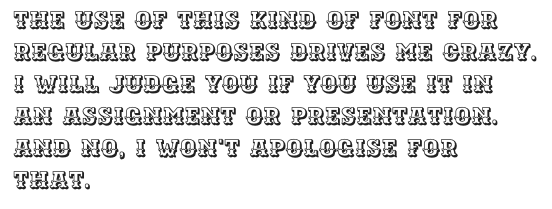
The other fonts I really dislike fall into two groups: anything over-decorative and wrongly sized formatting.
Over decorative fonts have their place, but trying to read a block of text printed in anything full of swirls and flourishes or trippy lines and shadows will make a teacher’s eyes bleed in less than three minutes. Decorative fonts can work really well for titles, or for a special capital letter or character to start a page or chapter, but they fail miserably for anything that needs to communicate information or arguments clearly and effectively.
In a similar vein, text printed too small or too large is equally frustrating. If it’s too small and condensed, it’s hard to read and… you guessed it, bleeding eyeballs. At the other end of the equation, students may think they can fool me into believing their 337words meets the 500 word minimum word count if their work is formatted in size 15 Helvetica, but my teacher brain knows better. My teacher brain has been doing this a lot longer than they have.
So, I guess this is me coming out of the classroom cupboard and acknowledging the ugliness of the deep-seated prejudice that lies deep within me. It is equally as rampant and undeniable as the grammar nerdism that I make no attempt to hide.
Call me fussy. Call me Fontist. I’m okay with that. But don’t call me to complain if I’ve asked your teen cherub to reprint an assignment so that I can read it without tears. Trust me – it’s better that way, and I’ve tried to be nice about it. Well, I’ve probably been nice..
Maybe.
Unless they are a repeat offender. In that case, there are no guarantees.